Brightline Dental — a clinic site that books patients in two taps
A concept website for a family dental clinic in Doha. One job: turn a visitor into a booked patient, at any hour, in English or Arabic.
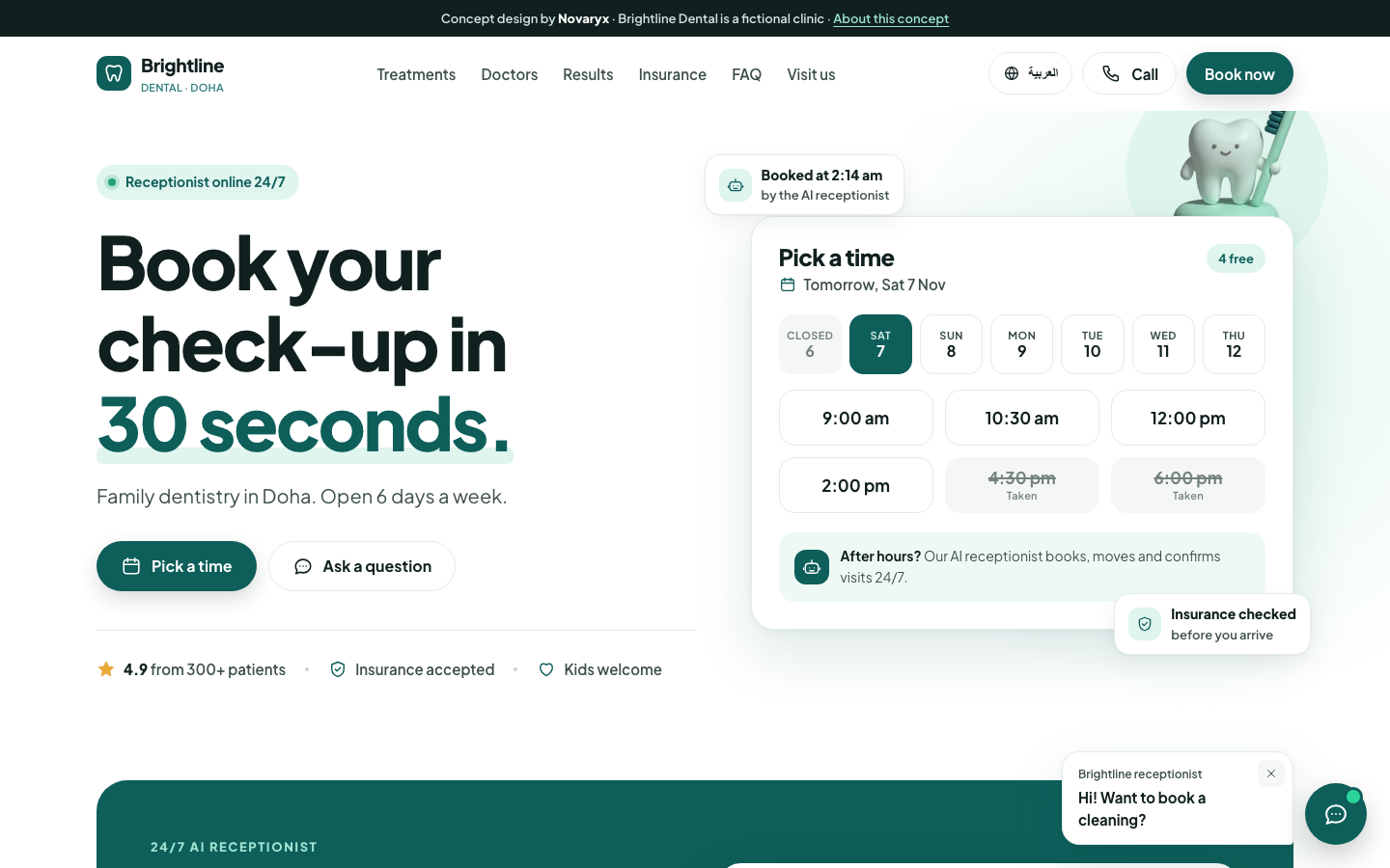
Patients don't wait. Most clinic websites make them.
Family clinics in Doha lose patients in the quiet hours. A parent searches at 11 pm, or on a Friday when the front desk is closed, finds a phone number nobody answers, and books somewhere else.
When a booking form does exist, it usually takes six or more steps: pick a service, a doctor, a branch, a date, fill a long form, wait for a call back. The brief was simple: make booking feel like two taps, and make sure every question gets an answer, day or night.
Three targets we designed against
These are concept targets that shaped every decision, not results from a live clinic.
-
2taps
From landing to a held slot
Pick a time, confirm your details. The booking card sits in the hero so nobody has to look for it.
-
24/7
Every question answered
An AI receptionist answers prices, insurance and hours, and books or moves visits while the clinic is closed.
-
<2s
Fast on a mid-range phone
Target: largest content shown in under two seconds on 4G, with WebP images and no heavy frameworks.
Brightline Dental is fictional. Numbers above are design targets for the concept.
From a one-line brief to a working site
-
01Step
Discover
We mapped what a patient actually wants to know before booking: when can I come, how much will it cost, do you take my insurance, and will someone speak my language. Everything else went below the fold.
-
02Step
Wireframe
Grey boxes first. The key decision happened here: the booking card lives in the hero, right next to the headline, on desktop and on phones.
Desktop hero Phone hero -
03Step
Design
White space, one calm mint-and-teal palette, and a single typeface. The clinic should feel clean and friendly, like a good waiting room, never clinical or loud.
-
04Step
Build & test
Hand-written HTML, CSS and a little JavaScript. Tested by keyboard and screen reader, from 360px phones to 1920px screens, in both languages, and with motion turned off.
A small system that feels like care
Five colours, one typeface, rounded corners, soft shadows. Small enough that every page stays consistent.
Palette
Mint for calm, teal for action. Body text in near-black ink passes WCAG AA on every background used.
- White
#FFFFFF - Mint
#DFF5EE - Teal
#0E5E5A - Ink
#10201F - Mist
#F4F7F6
Type: Plus Jakarta Sans
Round, open letterforms that stay readable at small sizes on phones.
Components
Live components from the site. Try the slots.
Time slot states
Chat bubbles
Buttons
What the site does for the clinic
-
Booking in two taps
Pick a day and a time in the hero card, add a name and phone number, done. A confirmation screen shows the summary straight away.
-
24/7 AI receptionist
A demo chat that answers prices, insurance and hours, and books a visit when the desk is closed.
-
Before / after slider
Drag or use arrow keys to compare smiles. Drawn in SVG, so it is sharp and light.
-
Bilingual EN / AR
One switch flips the whole page to Arabic with a true right-to-left layout.
-
Sticky bar on mobile
Book now, chat and call stay under the thumb on every screen of the page.
Built to pass, not just to look good
Google Lighthouse scores for the home page on mobile settings (6 Nov 2026). Desktop scores 100 in all four.
Performance
Accessibility
Best practices
SEO
Checklist
- WCAG AA colour contrast
- Fully keyboard navigable
- Respects reduced motion
- Structured data for a dental clinic
- Responsive from 360 to 1920px
See the live concept
Book a fake check-up, chat with the receptionist, switch to Arabic.